
In today's competitive e-commerce landscape, page load speed is not just a feature; it's a critical factor determining the success of an online store. Especially with headless platforms like Shopify Hydrogen, where you have full control over the user interface, optimizing performance becomes the developer's responsibility. Among the factors affecting speed, images are often the biggest culprits of slow loading times. An effective image optimization strategy not only significantly improves user experience but also has a positive impact on SEO and conversion rates.
This article will delve into the importance of image optimization in Shopify Hydrogen, while providing practical strategies, tools, and techniques you can implement immediately to transform heavy images into speed assets for your store.
I. Why image optimization matters so much in Hydrogen storefronts
Hydrogen apps are often more visual and more interactive than standard Online Store 2 point 0 themes. You might use:
- Full width hero banners
- High resolution product photography
- Editorial content and lifestyle imagery
- Icons and illustration sets
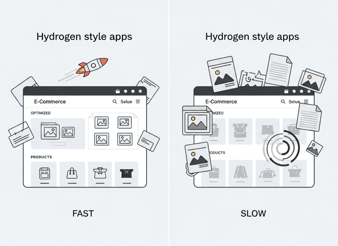
That visual richness is great for branding, but it can destroy perceived performance if you treat every image as a raw 4K asset.
Key reasons to prioritize images in Hydrogen:
-
Largest Contentful Paint (LCP)
The LCP element is frequently an image: a hero banner or main product photo. If that image is big, slow, or render blocked, your LCP score tanks. -
Mobile first reality
Most shoppers browse on mobile, often on slower connections. A desktop hero at 2400 pixels wide is wasted bandwidth on a 390 pixel screen. -
Hydrogen is flexible, not magical
Hydrogen provides tools like theImagecomponent, Shopify CDN, and GraphQL transforms. They help a lot, but they do not remove the need to think carefully about formats, sizing, lazy loading, and placeholders. -
SEO and paid traffic ROI
Better image performance improves Core Web Vitals, which influences search ranking and quality scores for ad platforms. That translates into more traffic and cheaper clicks.
In short, Hydrogen gives you the control to build a very fast storefront, but image optimization is one of the places where you must make deliberate choices.
II. How Shopify and Hydrogen handle images under the hood
Before adjusting anything, it helps to understand the pipeline from merchant upload to browser display.
2.1 Shopify CDN and automatic transforms
When a merchant uploads product images, collection banners, or media to Shopify, those assets are stored and served from Shopify’s global CDN. The platform already performs some basic optimization:
- Caching at edge locations
- Lossy compression for JPEGs
- Resizing variants behind the scenes
Shopify also exposes powerful image transforms through the Storefront API. In GraphQL queries, you can specify things like:
-
maxWidthandmaxHeight -
cropstrategy -
scalefactor -
preferredContentTypefor modern formats like WEBP
These transforms are essential pieces of a Hydrogen image strategy.
2.2 The Hydrogen Image component
Hydrogen ships with an Image component that wraps Shopify images and automates many best practices:
- Generates responsive
srcsetfrom Shopify image data - Chooses optimal sizes for different devices
- Plays nicely with edge rendering and streaming
- Can lazy load and set decoding strategies
Used correctly, this component drastically reduces the boilerplate needed for responsive images and ensures you benefit fully from Shopify’s CDN optimization.
2.3 Hydrogen, Remix, and streaming
Hydrogen built on Remix supports server side rendering and streaming responses. That means your markup for images can start arriving before all client side JavaScript loads.
However, the browser still needs to download and decode image bytes. If the hero or primary product image is giant or poorly configured, it will still delay LCP. That is why both server side and client side concerns matter in your image setup.
III. Set clear performance and UX goals for images
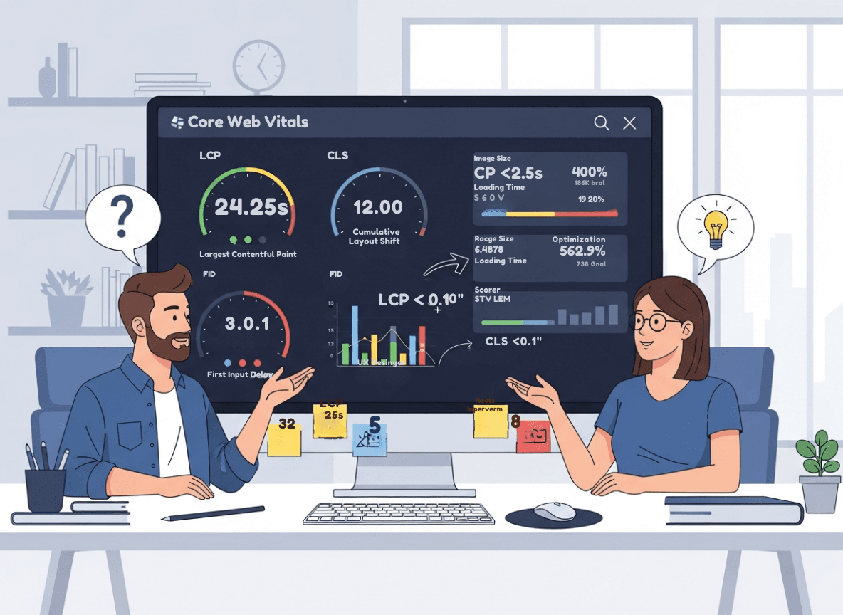 Instead of randomly tweaking props, define targets and constraints:
-
LCP under 2 point 5 seconds on typical mobile conditions
-
CLS near zero from image related layout shifts
-
Total image bytes per page within a budget
-
Visual quality acceptable on retina devices
A simple starting budget:
- Home and collection pages: try to keep total image transfer under 1 to 1 point 5 MB on mobile
- Product detail pages with many media items: under 2 MB for initial viewport
Use Lighthouse or PageSpeed Insights to check whether images are responsible for red metrics. Then refine your targets based on device analytics and user behavior.
IV. Core principles of shopify hydrogen image optimization
No matter which components you use, keep these principles in mind.
4.1 Serve only the pixels the user needs
Never send a 2400 pixel wide image to a device that can only display 400 pixels in that context.
Use:
-
Shopify GraphQL transforms (
maxWidth,maxHeight) -
Hydrogen
Imagecomponent withwidthsorsizesprops -
Layout constraints in CSS to avoid wasteful scaling down in the browser
4.2 Use modern image formats where possible
Modern formats compress better:
- WEBP is supported broadly and often 25 to 30 percent smaller than JPEG
- AVIF can be even smaller but has more patchy support and slower encoding
Shopify can output WEBP directly from the CDN. Prefer WEBP for photos and illustrations that do not require full fidelity.
4.3 Compress aggressively but smartly
Too much compression leads to visible artifacts, especially on product closeups where shoppers inspect details.
Fortunately, Shopify’s CDN already handles compression for you. When using external or manually hosted images, run them through tools like:
- ImageOptim
- Squoosh
- An automated build step in your CI
Aim for visually lossless on typical viewing sizes rather than perfection at 400 percent zoom.
4.4 Lazy load content that is below the fold
Users do not need images that are far down the page until they scroll. Lazy loading defers that work, reducing initial payload and speeding up time to interactive.
In Hydrogen, the Image component and modern browsers support native loading='lazy'. Use lazy loading for:
- Product gallery thumbnails
- Secondary content blocks lower on the page
- Blog post imagery below the first screen
4.5 Prioritize hero and primary product imagery
Conversely, your LCP image should not be lazy loaded. It needs to start downloading immediately.
For example:
- The main hero banner on home
- The featured product image above the fold on PDP
- Large offer banners in the first viewport
Configure these as loading='eager' and consider preloading key assets.
4.6 Prevent layout shift with explicit sizing
CLS often comes from images that load without reserved space, pushing content down when pixels arrive.
To prevent that:
-
Always specify
widthandheight, or -
Use the
aspectRatioprop on HydrogenImage, or -
Wrap images in containers with fixed aspect ratios using CSS
Hydrogen can infer sizes from Shopify image data. Use those dimensions to keep layouts stable.
V. Using the Hydrogen Image component effectively
The Hydrogen Image component is the workhorse of image optimization in most custom storefronts.
Below are common patterns and configurations.
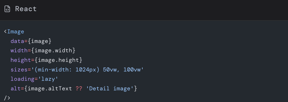
5.1 Basic product image example
A typical product card in a collection grid might look like this:
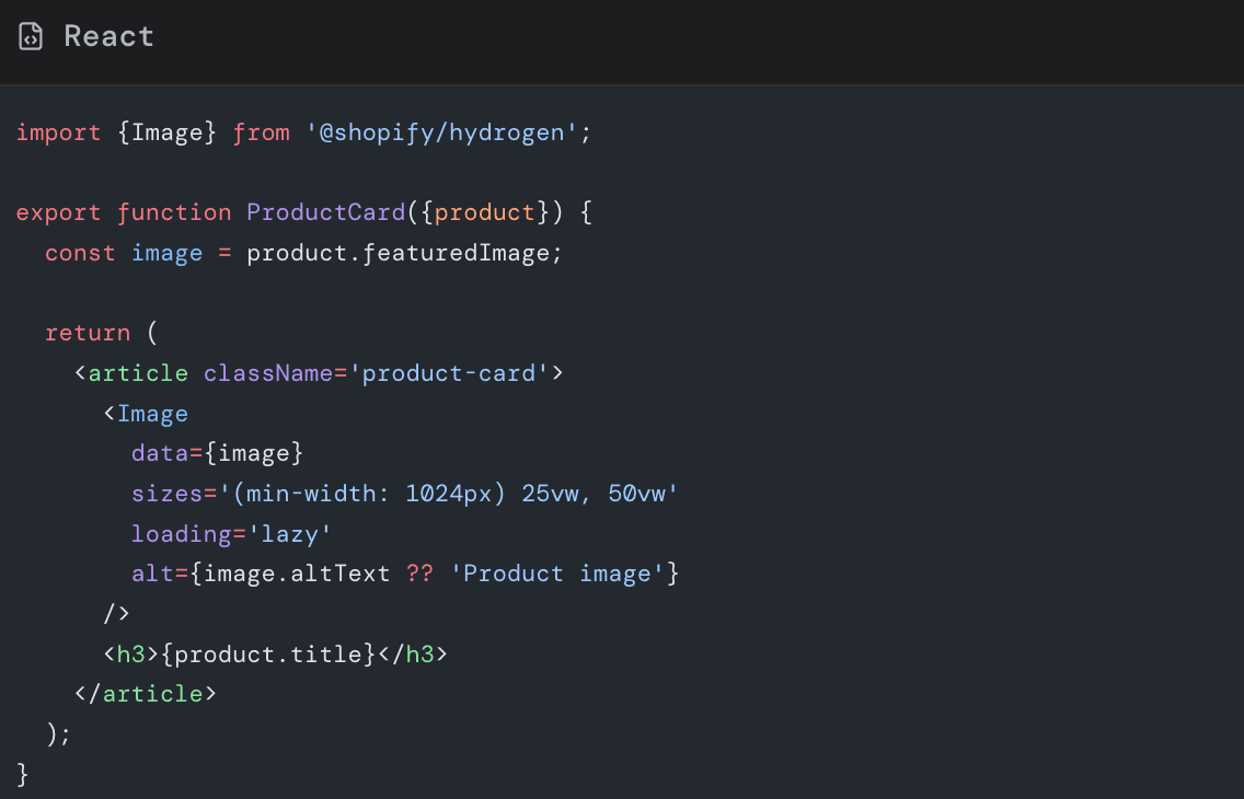
Key points here:
-
data={image}lets Hydrogen generate thesrcsetfrom Shopify data -
sizesinstructs the browser how much viewport width the image will occupy -
loading='lazy'for grid items below the main hero -
altuses merchant entered text with a safe fallback
The sizes string in this example roughly says:
- On screens wider than 1024 pixels, each card uses 25 percent of the viewport width
- Otherwise use 50 percent of the viewport width
The browser uses this hint along with srcset to pick the right variant.
5.2 Controlling widths for optimal srcset
You can pass a widths array to suggest explicit pixel widths:
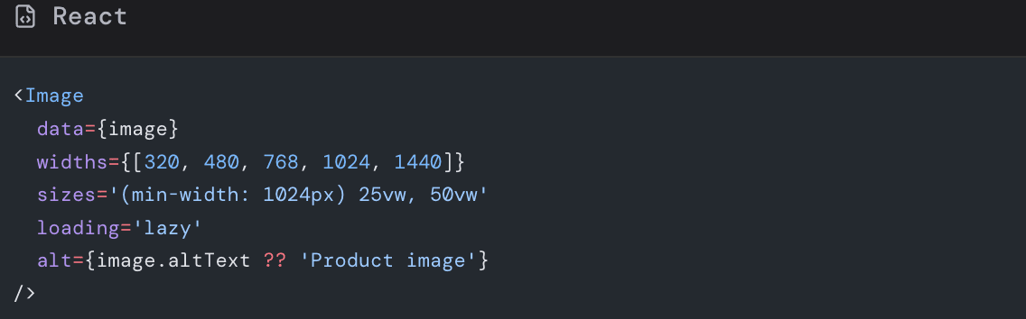
Hydrogen will request variants from Shopify around those widths, ensuring you do not serve a 2000 pixel image to a 320 pixel slot.
Choose widths that:
- Cover common device breakpoints
- Have modest gaps between them to avoid unnecessary variants
- Reflect the maximum size the image will ever appear in your layout
5.3 Hero image with eager loading and priority
For the primary hero above the fold, you want the opposite of lazy loading:
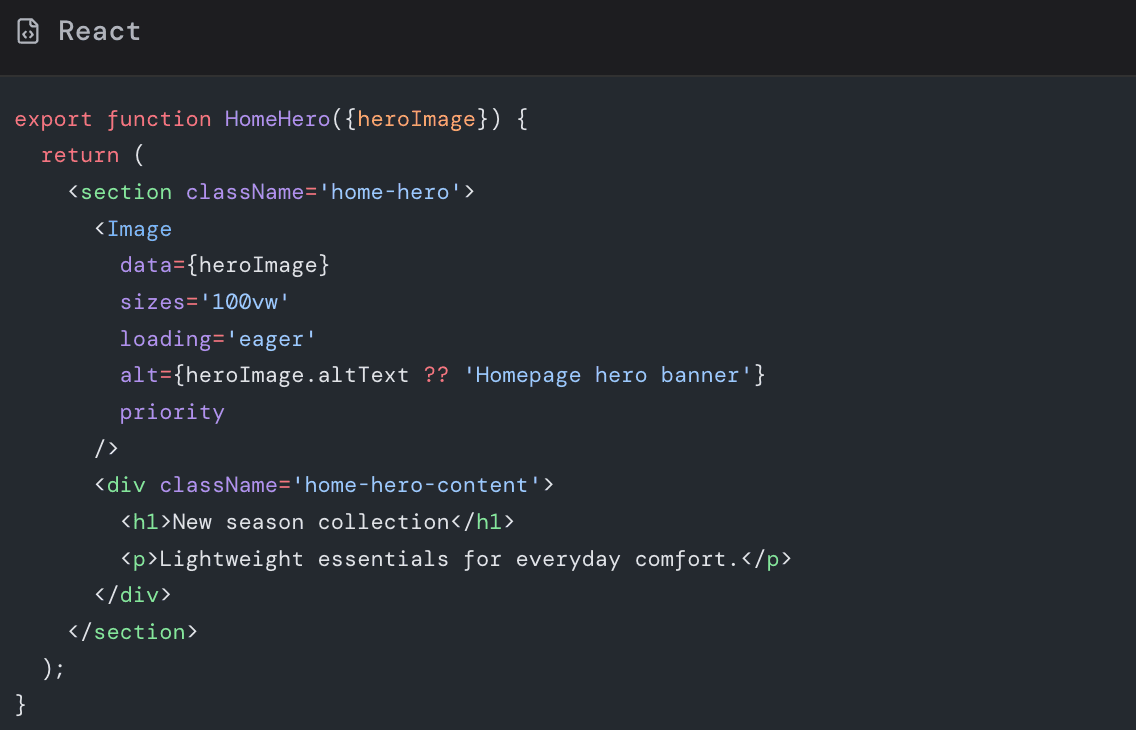
The priority prop (available in newer Hydrogen setups) signals that this image is critical, encouraging preloading and early fetching.
5.4 Thumbnails and secondary images
Smaller thumbnails or alternate angles can use constrained widths:
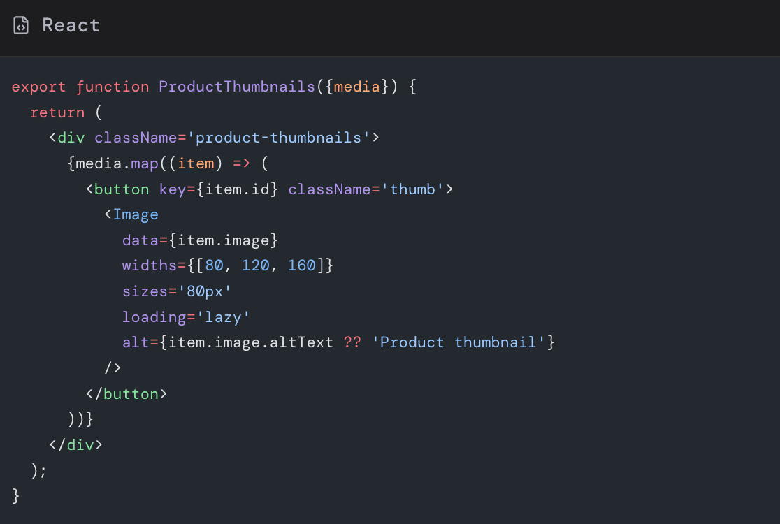
Because thumbnails are small and mostly decorative, you can:
-
Use smaller width variants
-
Allow more aggressive compression
-
Mark some as purely decorative with
alt=''in cases where thumbnails duplicate a main image for accessibility purposes
V. Leveraging Shopify GraphQL transforms with Hydrogen
Behind every Hydrogen Image, there is a Shopify CDN URL with transform parameters. You can take direct control when needed.
6.1 Fetch exactly what you need
Example GraphQL query for a product card:
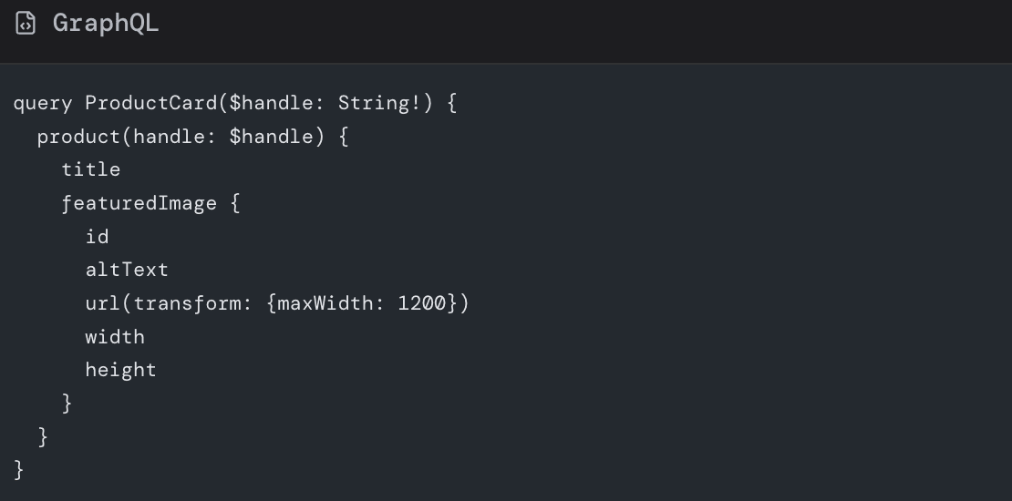
In this example:
-
maxWidth: 1200ensures Shopify never sends an image wider than 1200 pixels -
widthandheightgive you exact dimensions for layout and aspect ratio
6.2 Request modern formats from the CDN
Shopify supports enums like WEBP and AVIF for preferredContentType in image transforms.
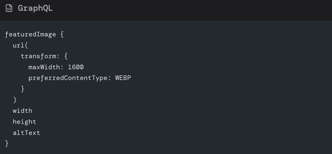
Then in Hydrogen, you still pass that data to the Image component, which can append additional responsive variants as needed.
When using preferredContentType, remember:
-
WEBP is a safe default for most modern browsers
-
If you serve non Shopify images, you might need your own transformation service or build step to generate WEBP or AVIF versions
VII. Preventing layout shift with stable image dimensions
CLS is one of the most visible UX problems: content jumps around as assets load.
Hydrogen helps by exposing width and height from Shopify data and by allowing explicit ratio control.
7.1 Use width and height when known
When you have fixed width and height, pass them to Image:
This lets the browser reserve exact space before the image bytes arrive.
7.2 Use aspectRatio for flexible layouts
Sometimes your CSS may scale images based on container width, but you still want consistent aspect ratios.
Hydrogen supports an aspectRatio prop:
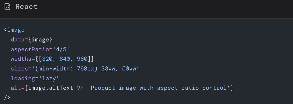
Here:
- The image will always render at a four to five ratio
- The browser reserves space accordingly
- You avoid jarring jumps in masonry or grid layouts
7.3 CSS based aspect ratio for background images
If you must use CSS background images (for design reasons), use aspect-ratio or padding tricks:
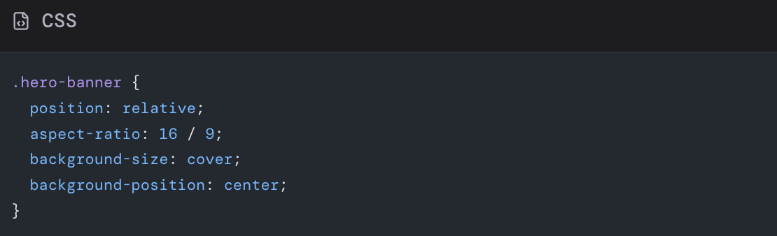
This ensures the section has consistent height before the background loads, helping CLS even when not using Hydrogen’s Image component directly.
VIII. Lazy loading strategy in Hydrogen
Lazy loading is extremely valuable, but misusing it can harm UX.
8.1 When to use eager loading
Use loading='eager' for:
- LCP hero image
- First product image above the fold on PDP
- Critical offer banners or above the fold brand imagery
You can combine loading='eager' with priority to further emphasize importance.
8.2 When to use lazy loading
Use loading='lazy' for:
- Product cards in grids below the hero
- Secondary images and carousels that start off screen
- Rich content further down long landing pages or blogs
Most Hydrogen projects make lazy the default and explicitly mark critical assets as eager.
8.3 Beware of interactions with sliders and carousels
Carousels (for example on PDP galleries) often use third party libraries or client side logic. When combined with lazy loading:
- Make sure images inside the initial slide are not blocked from loading
- Consider eager loading the first item and lazy loading subsequent slides
- Test on slower mobile to ensure the active slide appears instantly when users tap or swipe
IX. Placeholders and perceived performance
Even when actual byte download times are decent, users dislike blank boxes. Placeholders can create an impression of speed.
9.1 Types of placeholders
Common patterns:
- Blur up: show a very low resolution blurred version before the full image
- Solid color or gradient: match the dominant color of the image
- Skeleton blocks: gray boxes mimicking layout
Hydrogen’s image data from Shopify can provide small thumbnails or color hints that you turn into placeholders.
9.2 Implementing blur up with CSS classes
A simple blur up pattern:
- Render a small image or same image at low quality.
- Add CSS classes for blur and scale.
- Remove the blur once the high res variant finishes loading.
Example sketch:
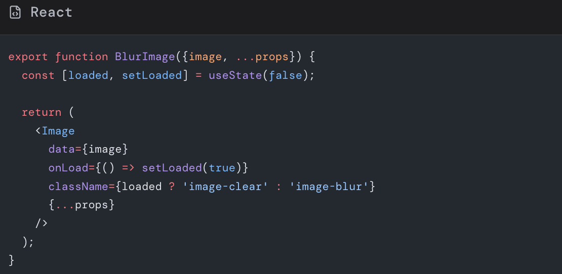
CSS:
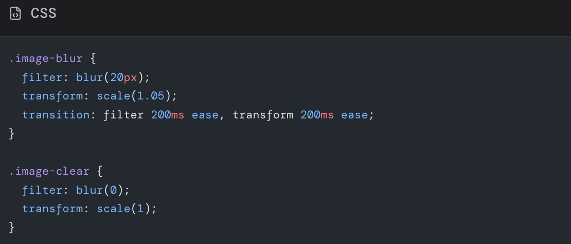
While this still loads bytes, it dramatically improves perceived smoothness.
9.3 Reserve space even with placeholders
Placeholders should not cause extra layout shift. Always keep:
-
widthandheight, or -
CSS
aspect-ratio
so that placeholder and final image have identical footprints.
X. Handling remote and non Shopify images
Not all images in a Hydrogen storefront come from Shopify product media. You might have:
- CMS hosted blog images
- Third party brand assets
- User generated content
10.1 Use Hydrogen Image with custom loaders
Hydrogen’s Image can accept a remote URL and a loader function to generate transformed URLs from your preferred image service.
Example:
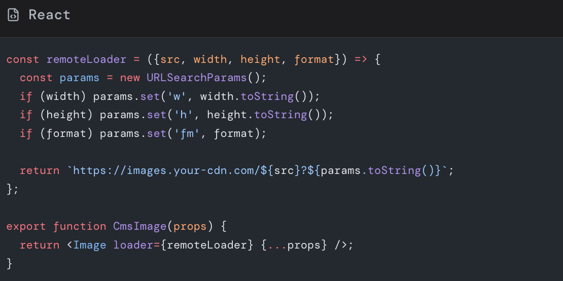
With a loader like this, you can reproduce the same responsive behavior for non Shopify assets.
10.2 Pre process remote assets when possible
If you control a CMS or brand asset pipeline:
- Enforce max dimensions on upload
- Auto generate WEBP or AVIF variants
- Strip metadata like EXIF when not needed
Doing this upstream avoids surprises during build or runtime.
XI. Background images and decorative graphics
Not every visual should be an actual Image component. Some assets are better as SVG or CSS.
11.1 Prefer SVG for icons and simple illustrations
SVGs are:
- Resolution independent
- Often smaller than raster equivalents
- Easy to style with CSS and animations
Inline SVG icons or icon fonts can reduce the number of HTTP requests and remove the need for multiple pixel density variants.
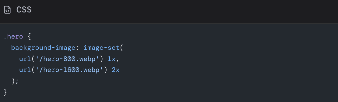
11.2 Use CSS backgrounds sparingly
CSS background images are sometimes appropriate:
- Hero overlays
- Subtle textures
- Decorations not essential to understanding content
However, they do not benefit from browser srcset and sizes in the same way as normal images. If a background is visually critical or large, consider:
-
Using an actual
-
Using
image-setin CSS to provide multiple resolutions
Example:
XII. Measuring and iterating on image performance
Optimization is not a one time task. You should measure, adjust, and monitor over time.
12.1 Use Lighthouse and PageSpeed Insights
These tools will:
- Flag images that are not in next gen formats
- Warn when images are too large for their display size
- Highlight opportunities for lazy loading and preloading
Run tests for:
- Home page
- Representative collection page
- High traffic PDP
- Key landing pages used in campaigns
12.2 Use Chrome DevTools
In Chrome DevTools:
- Open the Network tab.
- Filter by Images.
- Reload your page with throttled network (for example Fast 3G).
Inspect:
- Total transferred bytes
- Largest images and their dimensions
- Duplicate or unused images
You can also use the Performance tab to see which images load during LCP.
12.3 Monitor in production
Lab tests do not fully capture real user conditions. Add:
- Real user monitoring for Core Web Vitals
- Logging for image errors or unusually slow requests
- Alerts when LCP drifts above your target threshold
This helps you catch regressions when marketing teams upload new hero graphics or when you launch new templates.
XIII. Practical checklist for shopify hydrogen image optimization
Use this checklist as part of your development workflow.
Architecture
🔳 Use Hydrogen Image component wherever possible for product and media content
🔳 Use SVG or icon components for simple icons and logos
Sizing and responsive behavior
🔳 Define standard breakpoints and width sets for common components
🔳 Never serve images larger than their maximum display size
🔳 Use sizes attributes that match real layouts
Formats and compression
🔳 Prefer WEBP from Shopify CDN using preferredContentType where compatible
🔳 Compress external assets through a build pipeline or CDN
🔳 Avoid PNG for photos unless transparency is essential
Loading strategy
🔳 Mark the LCP image as loading='eager' and add priority
🔳 Default all below the fold images to loading='lazy'
🔳 Verify carousels load the active slide instantly on mobile
Layout stability
🔳 Provide width and height or aspectRatio for all significant images
🔳 Use CSS aspect-ratio for sections with background images
🔳 Confirm CLS from images is near zero in Lighthouse
Placeholders and UX
🔳 Add blur up or color placeholders for large hero and gallery images
🔳 Ensure placeholders do not change layout size
Monitoring
🔳 Regularly run Lighthouse or PageSpeed for key templates
🔳 Track Core Web Vitals in production
🔳 Embed image performance considerations in content and design workflows
XIV. Bringing it all together and next steps
Hydrogen gives you tremendous freedom to design immersive, branded storefronts. That freedom comes with the responsibility to treat images as first class performance citizens.
By combining:
-
Shopify CDN transforms and modern formats
-
Hydrogen
Imagecomponent with carefully chosensizes,widths, and loading strategies -
Stable layout dimensions and thoughtful placeholders
-
Continuous measurement with Lighthouse and real user metrics
you can deliver pages that feel instant, stable, and visually rich on every device.
If you already have a Hydrogen storefront in production, here is a simple action plan you can execute this week:
- Identify your top three traffic pages.
- Run them through Lighthouse or PageSpeed Insights.
- Note all image related recommendations.
- Refactor those pages to use Hydrogen
Imagecorrectly with responsive widths and proper loading attributes. - Switch suitable assets to WEBP via Shopify transforms.
- Re test and compare Core Web Vitals.
Then extend these patterns across the rest of your templates.
You do not need to overhaul your entire design to see meaningful wins. A handful of systematic changes to how you size, format, and load images can shave seconds off load times and create a smoother, more trustworthy shopping experience.
Now is a good time to look at your Hydrogen codebase and content library, decide where images are slowing you down, and optimize images so your storefront can fully showcase both your brand and the performance potential of Shopify Hydrogen.
Read more: