
A successful Shopify store needs more than attractive colors, polished product photos, and a modern theme.
Good Shopify store design brings together branding, user experience, navigation, product presentation, mobile usability, performance, and conversion strategy.
Every design decision should help shoppers answer a few important questions:
- What does this store sell?
- Is this product right for me?
- Can I trust this brand?
- How much does it cost?
- When will I receive it?
- How do I buy it?
The easier your store makes those decisions, the more effectively it can turn visitors into customers.
In this guide, we will explain what Shopify store design involves, how to plan your store, which pages matter most, common design mistakes to avoid, and how to create a storefront that is visually appealing without sacrificing usability or performance.
I. What Is Shopify Store Design?
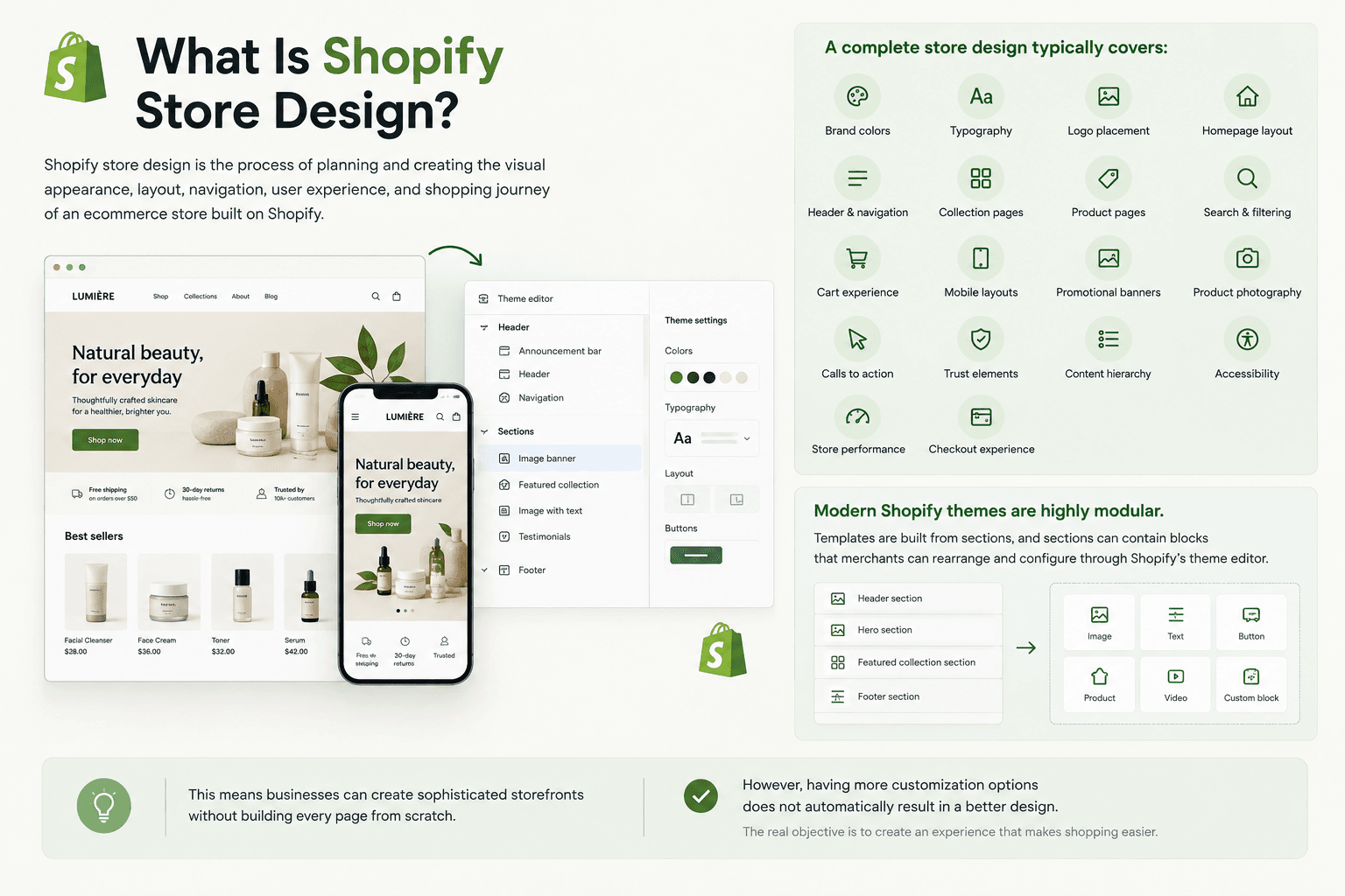 Shopify store design is the process of planning and creating the visual appearance, layout, navigation, user experience, and shopping journey of an ecommerce store built on Shopify.
It includes much more than choosing a Shopify theme.
A complete store design typically covers:
- Brand colors
- Typography
- Logo placement
- Homepage layout
- Header and navigation
- Collection pages
- Product pages
- Search and filtering
- Cart experience
- Mobile layouts
- Promotional banners
- Product photography
- Calls to action
- Trust elements
- Content hierarchy
- Accessibility
- Store performance
- Checkout experience
Shopify's theme editor lets merchants customize elements such as layouts, typography, colors, sections, and blocks without necessarily editing theme code. The exact options available depend on the theme being used.
Modern Shopify themes are highly modular. Templates are built from sections, and sections can contain blocks that merchants can rearrange and configure through Shopify's theme editor.
This means businesses can create sophisticated storefronts without building every page from scratch.
However, having more customization options does not automatically result in a better design.
The real objective is to create an experience that makes shopping easier.
II. Why Shopify Store Design Matters
Your storefront is often one of the first meaningful interactions a potential customer has with your business.
Visitors may discover you through:
- TikTok
- Influencers
- Paid advertisements
- Email campaigns
- Product recommendations
After clicking through, your Shopify store needs to continue the experience.
A confusing or poorly structured store can create friction even if the product itself is excellent.
Effective Shopify store design should therefore support several goals at the same time.
1. Build Brand Recognition
Your website should feel like your brand rather than a generic Shopify template.
Consistent use of:
- Colors
- Typography
- Photography
- Icons
- Tone of voice
- Spacing
- Product presentation
helps establish a recognizable visual identity.
2. Make Products Easier to Discover
Customers should not need to understand your internal product catalog to find what they need.
Clear navigation, useful collections, search, and filters can dramatically simplify product discovery.
3. Reduce Purchase Friction
Shoppers often hesitate because they are missing information.
For example:
- Which size should I choose?
- Does this ship to my country?
- Can I return it?
- Is this compatible with my device?
- What materials are used?
- What is included?
Good design places relevant information where customers naturally need it.
4. Support Conversion
A conversion-oriented design guides shoppers toward actions such as:
View Product → Select Variant → Add to Cart → Checkout
The objective is not to fill every part of the page with buttons.
Instead, important actions should be obvious while secondary information remains easy to access.
5. Support Store Performance
Design decisions also influence performance.
Large images, unnecessary animations, oversized scripts, complex carousels, and too many third-party applications can make a storefront slower.
Shopify's developer documentation specifically identifies performance as an important part of theme design and notes that it can affect customer experience, conversions, repeat business, and search visibility.
III. What Makes a Good Shopify Store Design?
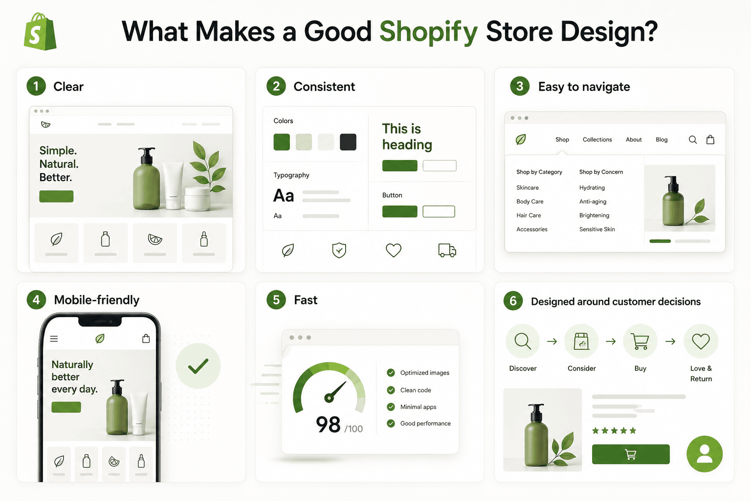 A strong Shopify store normally has six characteristics:
- Clear
- Consistent
- Easy to navigate
- Mobile-friendly
- Fast
- Designed around customer decisions
The visual design should support these principles rather than compete with them.
For example, a luxury skincare store and an electronics store may look completely different.
The skincare store may use:
- Large editorial photography
- Generous whitespace
- Soft typography
- Minimal navigation
The electronics store may require:
- Detailed specifications
- Comparison tools
- Category filters
- Compatibility information
- More structured product cards
Neither approach is automatically better.
The right Shopify store design depends on the products, customers, purchasing behavior, and brand positioning.
IV. How to Design a Shopify Store Step by Step
1. Define Your Store Requirements
Before choosing fonts or creating banners, define what the store actually needs to do.
Start with your products.
Ask:
- How many products will the store have?
- Are there multiple collections?
- Do products contain many variants?
- Do customers need filtering?
- Do products need subscriptions?
- Are products physical, digital, or both?
- Do customers need comparison features?
- Will the store sell internationally?
- Is the business B2C, B2B, or both?
Then consider your customers.
Understand:
- Who they are
- What they are buying
- Why they buy
- What information influences their decision
- What questions they ask before purchasing
- Which devices they typically use
A fashion store selling 50 products requires a different information architecture from a wholesale store managing thousands of SKUs.
Design should begin with business and customer requirements rather than aesthetics.
2. Plan the Store Architecture
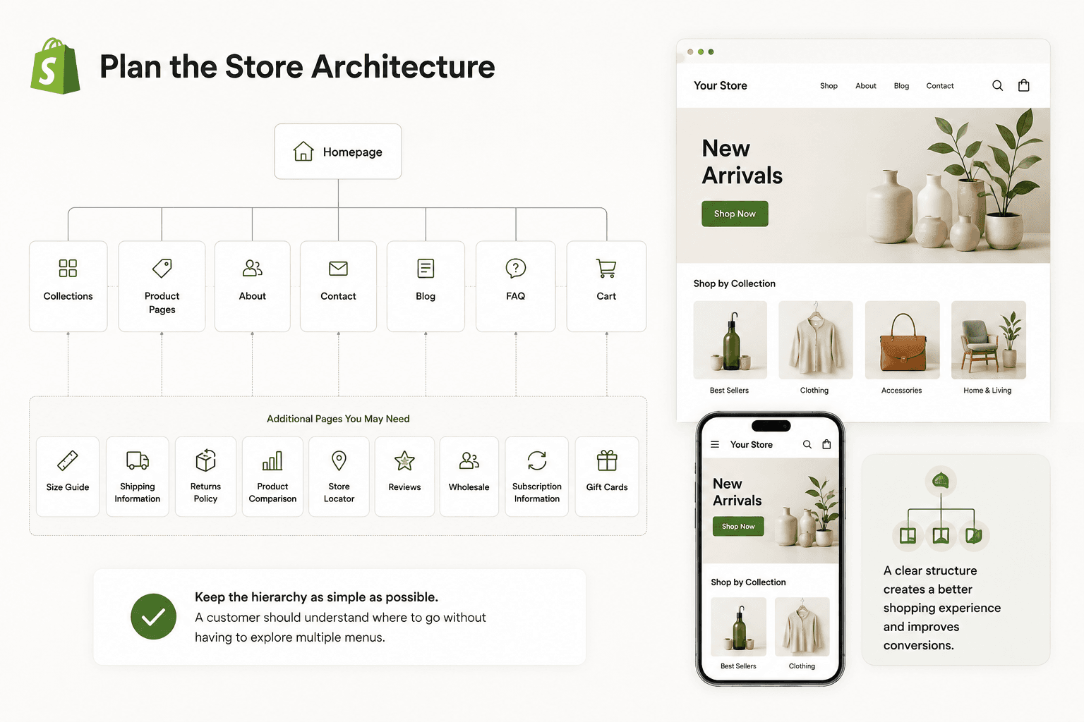
Before designing individual pages, create a clear site structure.
A typical Shopify store might include:
Homepage
→ Collections
→ Product Pages
→ About
→ Contact
→ Blog
→ FAQ
→ Cart
You may also need:
- Size Guide
- Shipping Information
- Returns Policy
- Product Comparison
- Store Locator
- Reviews
- Wholesale
- Subscription Information
- Gift Cards
Keep the hierarchy as simple as possible.
A customer should understand where to go without having to explore multiple menus.
3. Choose the Right Shopify Theme
Your theme controls much of your store's layout and visual framework.
Shopify currently supports several generations of theme architecture, including Online Store 2.0 themes and newer themes that support theme blocks, including Shopify's Horizon family. Themes using the newer architecture provide more flexible modular customization while retaining features available through Online Store 2.0.
When choosing a theme, do not focus only on the demo homepage.
Evaluate whether it supports the functionality your store needs.
Consider:
- Navigation style
- Mega menu support
- Product galleries
- Product filtering
- Quick add
- Product recommendations
- Variant presentation
- Cart drawer
- Promotional sections
- Video
- Testimonials
- Blog layouts
- Mobile navigation
- Search experience
- Localization requirements
Shopify also allows merchants to preview paid themes from the Shopify Theme Store and customize them before purchasing, making it easier to evaluate whether a theme fits a real catalog rather than judging it only from demo content.
3.1. Free Theme vs. Premium Theme vs. Custom Design
There are generally three approaches.
3.1.1. Free Shopify Theme
Best for:
- New stores
- Small catalogs
- MVP launches
- Businesses with simple requirements
Advantages:
- Lower initial cost
- Shopify-supported options are available
- Good starting point for customization
Limitations:
- Your store may need additional development for highly specific layouts or features.
3.1.2. Premium Shopify Theme
Best for:
- Growing stores
- Brands requiring more built-in sections
- Businesses wanting more advanced merchandising capabilities
Advantages:
- More design options
- Often includes advanced ecommerce components
- Can reduce dependence on apps or custom coding
3.2. Custom Shopify Store Design
Best for:
- Established brands
- Complex catalogs
- Unique customer journeys
- Businesses with specialized functionality
A custom design can begin from an existing theme or involve deeper Shopify theme development.
The goal should not be customization for its own sake.
Custom development is useful when it solves a real UX, merchandising, branding, or operational requirement.
4. Build a Consistent Visual Identity
Once the structure is established, define the visual system.
4.1. Colors
Choose:
- Primary brand color
- Secondary color
- Background colors
- Text colors
- Accent colors
- Button colors
- Error and success states
Avoid using too many competing colors.
Your primary call-to-action should remain visually recognizable throughout the storefront.
4.2. Typography
Use typography to establish hierarchy.
For example:
H1: Main page title
H2: Major section title
H3: Supporting subsection
Body: Product descriptions and general content
Small Text: Supporting metadata
Use readable font sizes and sufficient contrast.
Decorative fonts can be effective for branding, but long paragraphs should remain easy to scan.
4.3. Spacing
Whitespace is an important design element.
Products, headings, buttons, images, and text should have enough space to prevent pages from feeling crowded.
Consistency is particularly important.
If one section has 80 pixels of spacing while another has 15 pixels without a clear reason, the page can feel visually disconnected.
5. Design a Strong Homepage
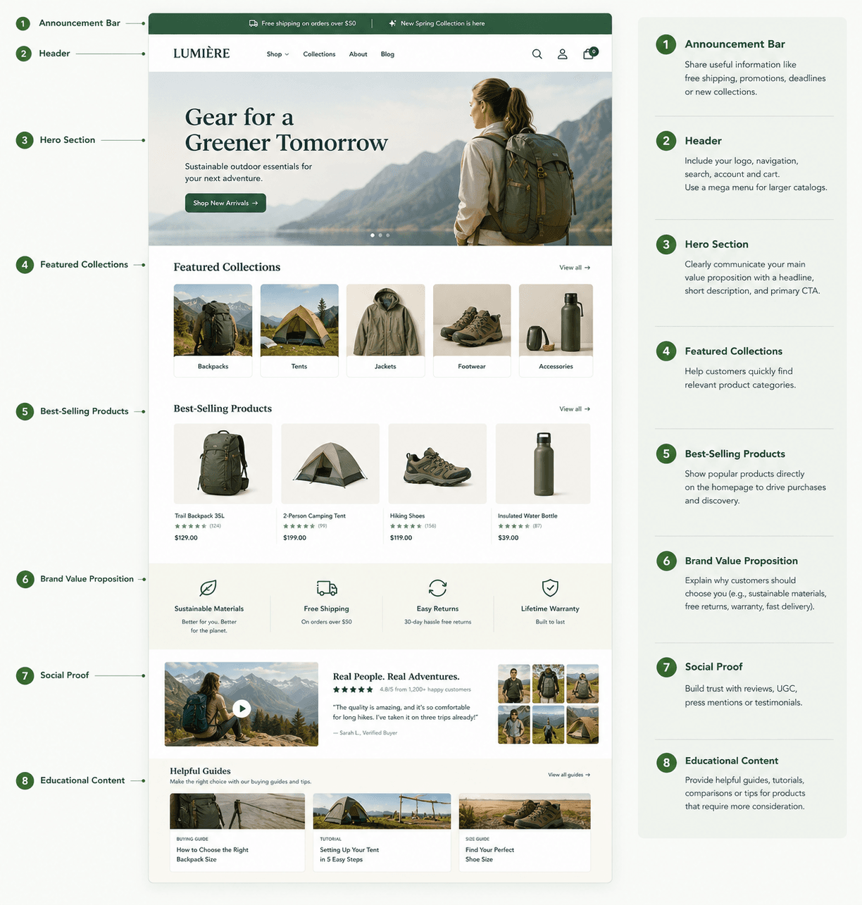
Your Shopify homepage should quickly communicate:
- What you sell
- Who it is for
- Why customers should care
- Where visitors should go next
A practical homepage structure might be:
5.1. Announcement Bar
Use it for genuinely useful information such as:
- Free shipping
- Current promotion
- Shipping deadline
- New collection
Avoid turning it into a constantly moving collection of messages.
5.2. Header
Include:
- Logo
- Navigation
- Search
- Account
- Cart
For larger catalogs, consider a mega menu.
5.3. Hero Section
Your hero should communicate the main value proposition clearly.
A common structure is:
Headline
Short supporting description
Primary CTA
Product or lifestyle imagery
For example:
Everyday Running Shoes Built for Long-Distance Comfort
Lightweight cushioning designed for daily training.
Shop Running Shoes
Avoid vague headlines such as:
Welcome to Our Store
They consume valuable visual space without explaining why someone should shop.
5.4. Featured Collections
Help customers quickly enter relevant product categories.
For example:
- New Arrivals
- Best Sellers
- Men
- Women
- Accessories
5.6. Best-Selling Products
Show popular products directly on the homepage if product discovery is important.
5.6.1. Brand Value Proposition
Explain why customers should choose you.
For example:
- Sustainable materials
- Free returns
- Handmade production
- Lifetime warranty
- Fast delivery
5.6.2. Social Proof
Depending on the business, this might include:
- Customer reviews
- User-generated content
- Press mentions
- Testimonials
5.6.3. Educational Content
Products that require more consideration may benefit from:
- Buying guides
- Tutorials
- Comparison guides
- Ingredient education
- Size advice
6. Improve Shopify Navigation
Navigation is one of the most important parts of Shopify store design.
Customers should be able to understand your product hierarchy immediately.
Instead of:
Products
consider categories such as:
Women | Men | Accessories | New Arrivals | Sale
For a skincare store:
Cleansers | Serums | Moisturizers | Sunscreen | Shop by Concern
For electronics:
Laptops | Displays | Keyboards | Audio | Accessories
The navigation should reflect how customers think about products.
Avoid exposing internal business terminology that shoppers may not understand.
6.1. Keep Important Pages Accessible
Your footer can contain secondary pages such as:
- About Us
- Contact
- FAQ
- Shipping
- Returns
- Privacy
- Terms
- Order Tracking
This keeps the primary navigation focused on shopping.
7. Design Better Collection Pages
Collection pages help customers browse multiple products.
A strong collection page should include:
- Clear collection title
- Optional short description
- Product grid
- Filtering
- Sorting
- Consistent product cards
7.1. Product Cards
A product card may contain:
- Product image
- Product name
- Price
- Compare-at price
- Review rating
- Available colors
- Promotional badge
- Quick add
Do not overload every product card.
Only display information that helps customers decide whether they should open the product page or add the item.
7.2. Filters
Large catalogs should provide useful filters.
Examples include:
Fashion
- Size
- Color
- Fit
- Material
- Price
Electronics
- Brand
- Screen size
- Storage
- Compatibility
- Price
Furniture
- Material
- Color
- Room
- Dimensions
- Style
Design filters around real buying criteria.
8. Create High-Converting Product Pages
Product pages are one of the most important areas of Shopify store design.
A customer who reaches a product page is already considering a specific item.
The design should help them make a confident decision.
8.1. Above the Fold
The initial product area usually needs:
- Product images
- Product title
- Price
- Variant selector
- Quantity if relevant
- Add to Cart button
- Important purchase information
For some products, this may also include:
- Reviews
- Financing information
- Subscription options
- Delivery estimate
- Stock status
8.2. Product Photography
Use consistent, high-quality photography.
Depending on the product, include:
- Front view
- Back view
- Side view
- Detail shots
- Scale reference
- Lifestyle photography
- Packaging
- Product video
The goal is to reduce uncertainty.
8.3. Product Description
Do not simply upload a large paragraph supplied by the manufacturer.
Structure product information.
For example:
Why You'll Love It
Short benefit-focused introduction.
Key Features
- Lightweight construction
- Water-resistant material
- Adjustable fit
Materials
88% recycled nylon, 12% elastane.
Size & Fit
Model measurements and sizing information.
Care
Cleaning or maintenance instructions.
Shipping & Returns
Brief summary with a link to complete policies.
This structure is much easier to scan.
9. Make the Add-to-Cart Action Obvious
Your primary CTA should be easy to identify.
Usually:
Add to Cart
or
Buy Now
Avoid changing standard ecommerce language simply to sound creative.
For example:
Make It Mine
may sound playful, but Add to Cart communicates the action immediately.
Clarity usually matters more than clever wording at critical purchasing steps.
Make sure:
- The button has sufficient contrast
- The label is clear
- Disabled states are understandable
- Variant errors are visible
- Stock messages are not confusing
10. Design for Mobile First
A Shopify store may look excellent on a large desktop monitor and still provide a poor experience on a phone.
Mobile design needs deliberate attention.
Check:
- Header size
- Menu behavior
- Font size
- Product card width
- Image cropping
- Button size
- Variant selectors
- Filter controls
- Sticky elements
- Popups
- Cart drawer
- Forms
Avoid simply shrinking a desktop layout.
Mobile screens require stronger prioritization because less information can be shown at once.
Shopify's current theme development guidance recommends responsive layouts rather than maintaining separate duplicated desktop and mobile markup, because unnecessary duplication increases browser work and can negatively affect performance metrics.
11. Optimize Images Without Destroying Performance
Large product photography is important for ecommerce.
But uploading visually impressive assets without considering performance can slow the storefront.
Use appropriately sized responsive images.
Shopify recommends using responsive image markup so browsers can choose an image size appropriate for the visitor's viewport rather than forcing mobile devices to download unnecessarily large desktop images.
Also avoid lazy-loading every image.
Images below the initial viewport can often be lazy-loaded, while an important hero or Largest Contentful Paint image generally needs to load immediately. Shopify specifically warns against lazy-loading the LCP image.
Developers should also provide image dimensions to reduce unexpected layout movement while pages load. Shopify's image_tag Liquid filter can automatically add width and height information.
12. Avoid Overusing Animations
Animation can make a storefront feel polished.
Examples include:
- Button hover states
- Image transitions
- Cart drawer animations
- Subtle content reveals
But excessive animation can become distracting.
Common problems include:
- Every section fading in
- Slow page transitions
- Large parallax backgrounds
- Heavy video backgrounds
- Autoplay sliders
- Delayed product information
Customers should never have to wait for an animation before they can understand or interact with the page.
Design motion to support the interface—not become the interface.
13. Build Trust Into the Store Design
Trust does not come from adding a giant row of security badges to every page.
Instead, create trust throughout the entire experience.
Useful trust signals can include:
- Professional product photography
- Clear pricing
- Detailed descriptions
- Accessible contact information
- Real customer reviews
- Shipping information
- Return policies
- Brand story
- Consistent visual identity
- Accurate stock information
- Secure and familiar checkout experience
For premium products, trust becomes even more important because the financial commitment is higher.
Provide enough information to justify the purchase.
14. Keep the Cart Experience Simple
After someone adds a product to the cart, avoid introducing unnecessary obstacles.
A cart should clearly display:
- Product
- Variant
- Quantity
- Price
- Subtotal
- Remove option
- Checkout CTA
Depending on the business, useful additions may include:
- Free-shipping progress
- Gift options
- Cross-sells
- Order notes
Cross-selling can increase order value, but it should not overwhelm the primary checkout action.
15. Think Carefully About Checkout
The storefront and checkout should feel like parts of the same customer journey.
Maintain consistent branding where Shopify's available customization options allow it.
Shopify provides a dedicated checkout and accounts editor for supported checkout customization, while some more advanced market-specific checkout customization capabilities depend on the merchant's plan. For example, Shopify currently documents market-specific checkout and account-page customizations as features for Advanced and Plus stores.
Do not design a highly customized storefront only to introduce unnecessary complexity immediately before payment.
The closer shoppers get to purchase, the more important clarity becomes.
16. Design for International Customers
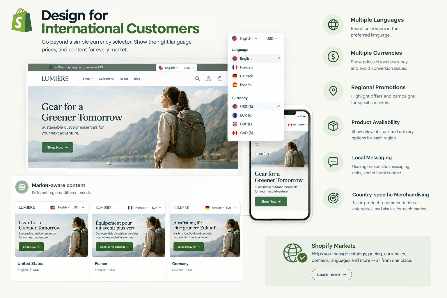
If your business sells internationally, Shopify store design may also need to account for:
- Languages
- Currencies
- Regional promotions
- Product availability
- Local messaging
- Country-specific merchandising
Shopify Markets can support different market configurations involving elements such as catalogs, pricing, currencies, domains, languages, and storefront customization.
Shopify also supports certain theme customizations for individual markets, including differences in section content, images, block visibility, ordering, and section settings. Shopify currently lists per-market theme customization as an Advanced-or-higher feature.
International design should therefore go beyond simply adding a currency selector.
Think about what different audiences actually need to see.
17. Make Accessibility Part of the Design
Accessibility should be considered from the beginning rather than treated as a final checklist.
Shopify's theme accessibility guidance is developed with the Web Content Accessibility Guidelines (WCAG) in mind and covers areas including keyboard interaction, page structure, media, color contrast, dynamic components, and touch devices.
Important considerations include:
- Adequate text contrast
- Readable font sizes
- Keyboard-accessible navigation
- Visible focus states
- Descriptive alternative text
- Proper heading structure
- Accessible form labels
- Understandable error messages
- Large enough interactive targets
Accessibility generally improves usability for everyone.
18. Reduce Unnecessary Shopify Apps
Apps can add valuable functionality.
However, installing an app for every minor requirement can create unnecessary complexity.
Before installing an app, ask:
- Does Shopify already support this feature?
- Does the theme already support it?
- Could it be implemented efficiently through theme development?
- Is the app necessary for business operations?
- What impact does it have on storefront performance?
- Will removing it later be difficult?
Examples of functionality frequently added through apps include:
- Product reviews
- Search
- Filtering
- Bundles
- Subscriptions
- Loyalty programs
- Wishlist
- Upsells
- Personalization
Use apps strategically.
More functionality does not automatically mean a better customer experience.
19. Consider Shopify Store Performance During Design
Performance is not only a development issue.
Design choices often determine what developers eventually have to load.
For example, a designer might request:
- Five autoplay videos
- Three sliders
- Custom fonts in eight weights
- Animated product cards
- Multiple tracking widgets
Each component introduces potential performance costs.
Instead, prioritize elements that support actual customer decisions.
Shopify provides a CDN infrastructure for storefront assets and automatically applies technologies such as compression to supported assets, but theme implementation and third-party resources still have a major influence on the final customer experience.
For important hero images, Shopify's current performance guidance also recommends using image elements rather than CSS background images when the asset is likely to become the page's Largest Contentful Paint element. This allows the browser to discover and prioritize the image earlier.
20. Create Reusable Sections Instead of One-Off Pages
One major advantage of Shopify's modern theme architecture is modularity.
Sections and blocks allow store owners to rearrange and manage storefront content without modifying code for every change.
Instead of developing ten completely separate promotional layouts, consider building reusable sections such as:
- Image + text
- Hero banner
- Product grid
- Collection cards
- Testimonials
- Logo list
- Video
- FAQ
- Before/after
- Comparison table
- Feature icons
- Newsletter signup
Merchants can then reuse these components across different templates.
This makes the store easier to maintain after launch.
V. Essential Pages for a Shopify Store
A typical Shopify store should consider the following pages.
The exact structure depends on the business.
Do not create pages simply because competitors have them.
Every page should serve a purpose.
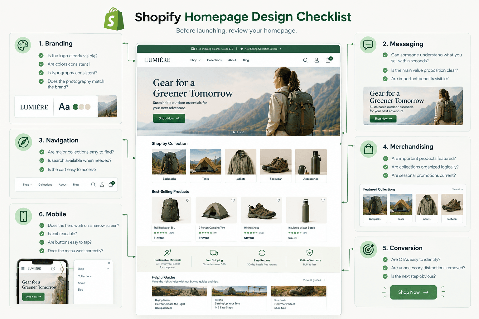
VI. Shopify Homepage Design Checklist
Before launching, review your homepage.
Branding
- Is the logo clearly visible?
- Are colors consistent?
- Is typography consistent?
- Does the photography match the brand?
Messaging
- Can someone understand what you sell within seconds?
- Is the main value proposition clear?
- Are important benefits visible?
Navigation
- Are major collections easy to find?
- Is search available when needed?
- Is the cart easy to access?
Merchandising
- Are important products featured?
- Are collections organized logically?
- Are seasonal promotions current?
Conversion
- Are CTAs easy to identify?
- Are unnecessary distractions removed?
- Is the next step obvious?
Mobile
- Does the hero work on a narrow screen?
- Is text readable?
- Are buttons easy to tap?
- Does the menu work correctly?
VII. Shopify Product Page Design Checklist
Review every major product type.
- Clear product name
- Correct price
- High-quality images
- Useful image gallery
- Clear variant selection
- Visible Add to Cart button
- Product benefits
- Specifications
- Size information
- Shipping information
- Return information
- Stock status
- Relevant reviews
- Mobile-friendly layout
- Recommended products where useful
Also test unavailable variants.
Customers should understand immediately why an option cannot be purchased.
VIII. Common Shopify Store Design Mistakes
1. Designing Only for Appearance
A beautiful page can still have poor usability.
Every visual decision should support the shopping journey.
2. Copying Another Shopify Store
Competitor research can be useful.
Copying another store's layout without understanding its business model is not.
Their:
- Audience
- Product catalog
- Price point
- Brand awareness
- Customer journey
may be completely different from yours.
3. Using Too Many Homepage Sections
Adding more sections does not necessarily create more value.
A homepage with 20 competing sections can make important information harder to notice.
Prioritize.
4. Poor Mobile Design
Do not approve the design based only on desktop screenshots.
Test actual mobile interactions.
5. Hiding Important Information
Customers should not have to search through several accordions to discover basic information such as:
- Materials
- Dimensions
- Delivery
- Returns
Use progressive disclosure, but keep essential purchase information visible.
6. Installing Too Many Apps
Every new feature should solve a measurable customer or business problem.
Avoid adding functionality simply because an app looks interesting.
7. Too Many Popups
A visitor should not encounter:
- Cookie popup
- Newsletter popup
- Discount wheel
- Chat popup
- Push notification request
within the first few seconds.
Prioritize the shopping experience.
8. Poor Product Photography
Design cannot compensate for unclear product presentation.
Customers need to see what they are buying.
9. Weak Call-to-Action Hierarchy
If five buttons have equal visual weight, customers may not know which action matters.
Create clear primary and secondary actions.
10. Ignoring Page Speed Until Launch
Performance should be considered during both design and development.
Optimizing only after every visual feature has been implemented is usually more difficult.
IX. Shopify Store Design and SEO
SEO and store design should work together.
Good ecommerce structure can make both browsing and crawling easier.
Important areas include:
Logical Navigation
Use understandable categories and hierarchy.
Heading Structure
Create a meaningful structure using H1, H2, and H3 headings rather than choosing heading levels purely for visual size.
Product Content
Provide original, useful product information rather than relying only on manufacturer descriptions.
Internal Linking
Connect related:
- Products
- Collections
- Buying guides
- Blog content
Image Optimization
Use meaningful alternative text when an image conveys relevant content.
Mobile Usability
Ensure pages are easy to navigate and interact with on smaller devices.
Performance
Avoid unnecessarily heavy page components.
Design and SEO should not be treated as separate projects.
Both depend on a clear, useful website structure.
X. How Much Does Shopify Store Design Cost?
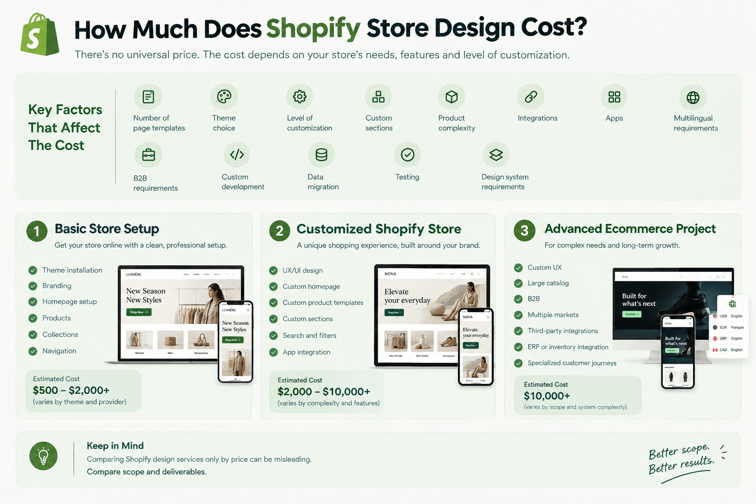 There is no universal Shopify store design price.
Cost depends on factors such as:
- Number of page templates
- Theme choice
- Level of customization
- Custom sections
- Product complexity
- Integrations
- Apps
- Multilingual requirements
- B2B requirements
- Custom development
- Data migration
- Testing
- Design system requirements
A basic theme setup is very different from a completely customized ecommerce experience.
Before requesting a quote, define the scope.
For example:
Basic Store Setup
- Theme installation
- Branding
- Homepage setup
- Products
- Collections
- Navigation
Customized Shopify Store
- UX/UI design
- Custom homepage
- Custom product templates
- Custom sections
- Search and filters
- App integration
Advanced Ecommerce Project
- Custom UX
- Large catalog
- B2B
- Multiple markets
- Third-party integrations
- ERP or inventory integration
- Specialized customer journeys
Comparing Shopify design services only by price can therefore be misleading.
Compare scope and deliverables.
XI. Do You Need a Shopify Designer or Developer?
Sometimes you need one.
Sometimes you need both.
A Shopify designer typically focuses on:
- Brand identity
- UX
- UI
- Layout
- Navigation
- Conversion journey
- Mobile design
A Shopify developer typically works on:
- Liquid
- Theme architecture
- CSS
- JavaScript
- Custom sections
- Shopify integrations
- App implementation
- Technical performance
For custom stores, the strongest workflow usually involves close collaboration between design and development.
Shopify itself recommends maintaining feedback between theme designers and developers and warns against sacrificing storefront performance for visual design.
XII. Shopify Store Design Process
A professional Shopify design project can follow this workflow:
Step 1: Discovery
Understand:
- Business
- Products
- Customers
- Competitors
- Requirements
Step 2: Information Architecture
Define:
- Navigation
- Collections
- Pages
- Product hierarchy
Step 3: Wireframes
Plan:
- Page structure
- Content priority
- User journey
Step 4: Visual Design
Create:
- Colors
- Typography
- Components
- Buttons
- Product cards
- Page layouts
Step 5: Shopify Development
Translate designs into:
- Templates
- Sections
- Blocks
- Theme settings
- Functional components
Step 6: Product and Content Setup
Add:
- Products
- Collections
- Images
- Content
- Metadata
Step 7: Integration
Configure necessary:
- Apps
- Tracking
- Payments
- Shipping
- Marketing tools
Step 8: Quality Assurance
Test:
- Desktop
- Mobile
- Tablet
- Navigation
- Search
- Filters
- Product variants
- Cart
- Checkout
- Forms
- Links
- Tracking
Step 9: Performance Review
Review:
- Images
- Scripts
- Apps
- Fonts
- Above-the-fold resources
- Mobile behavior
Step 10: Launch and Improve
A Shopify store should not stop evolving after launch.
Use real customer behavior to identify improvements.
XIII. Shopify Store Design Best Practices
If you only remember a few principles from this guide, remember these:
1. Design for customers, not designers.
The store exists to help customers shop.
2. Make navigation predictable.
Customers should never wonder where products are located.
3. Prioritize mobile.
Do not treat it as a smaller version of desktop.
4. Keep product information easy to scan.
Customers rarely read ecommerce pages from beginning to end.
5. Make the purchasing action obvious.
Avoid unnecessary creativity around critical interactions.
6. Use consistent visual rules.
Colors, spacing, typography, and components should follow a system.
7. Avoid unnecessary functionality.
Every feature creates complexity.
8. Consider performance during design.
Do not wait until the store is finished.
9. Build reusable Shopify sections.
Make future content management easier.
10. Test the complete customer journey.
A beautiful homepage means little if selecting a variant or completing checkout is frustrating.
Final Thoughts
Successful Shopify store design is not about adding as many visual effects, apps, banners, or custom sections as possible.
It is about creating the clearest possible path between customer interest and purchase.
Start with your customers.
Understand what they need to know.
Build a logical store structure.
Choose a suitable Shopify theme.
Create a consistent visual identity.
Make products easy to discover.
Design strong product pages.
Optimize the experience for mobile.
Protect storefront performance.
Then test the complete journey from the homepage to checkout.
A Shopify store can be visually impressive and still fail to sell.
The strongest ecommerce designs achieve both goals:
They make the brand look great—and make buying feel easy.